
Family Photo Outfit Ideas: What to Wear So Everyone Looks Great Together
You've booked the session. The date is on the calendar. Now you're standing in front of your closet, pulling out shirts and holding them up against each other, wondering if that blue works with her green and whether the kids will cooperate in anything that isn't a superhero costume.
You're not alone. Outfit planning is the single most common source of stress before a family photo session — more than posing, more than timing, more than keeping the toddler awake. And it matters, because what your family wears directly affects how the photos feel. Not just how they look. How they feel.
Here's how to get it right without overthinking it.
Start With a Color Palette, Not Individual Outfits
The most common mistake families make is picking outfits in isolation. Mom finds a dress she likes. Dad grabs a nice shirt. The kids wear whatever's clean. Everyone looks fine on their own — but together, they look like four people who happened to be standing next to each other.
Instead, choose a color palette first and build everyone's outfit around it.
A color palette is 2–3 colors that work together. Not matching — coordinating. There's a big difference. Matching means everyone wears the same blue polo. Coordinating means one person wears navy, another wears cream, one kid wears dusty blue, and the other wears tan. Same family of colors, different pieces. That's what makes photos look intentional without looking forced.
Color Palettes That Photograph Well
Some colors look incredible on camera. Others fall flat or fight with natural skin tones. Here's what works in our studio and on location across the Bay Area:
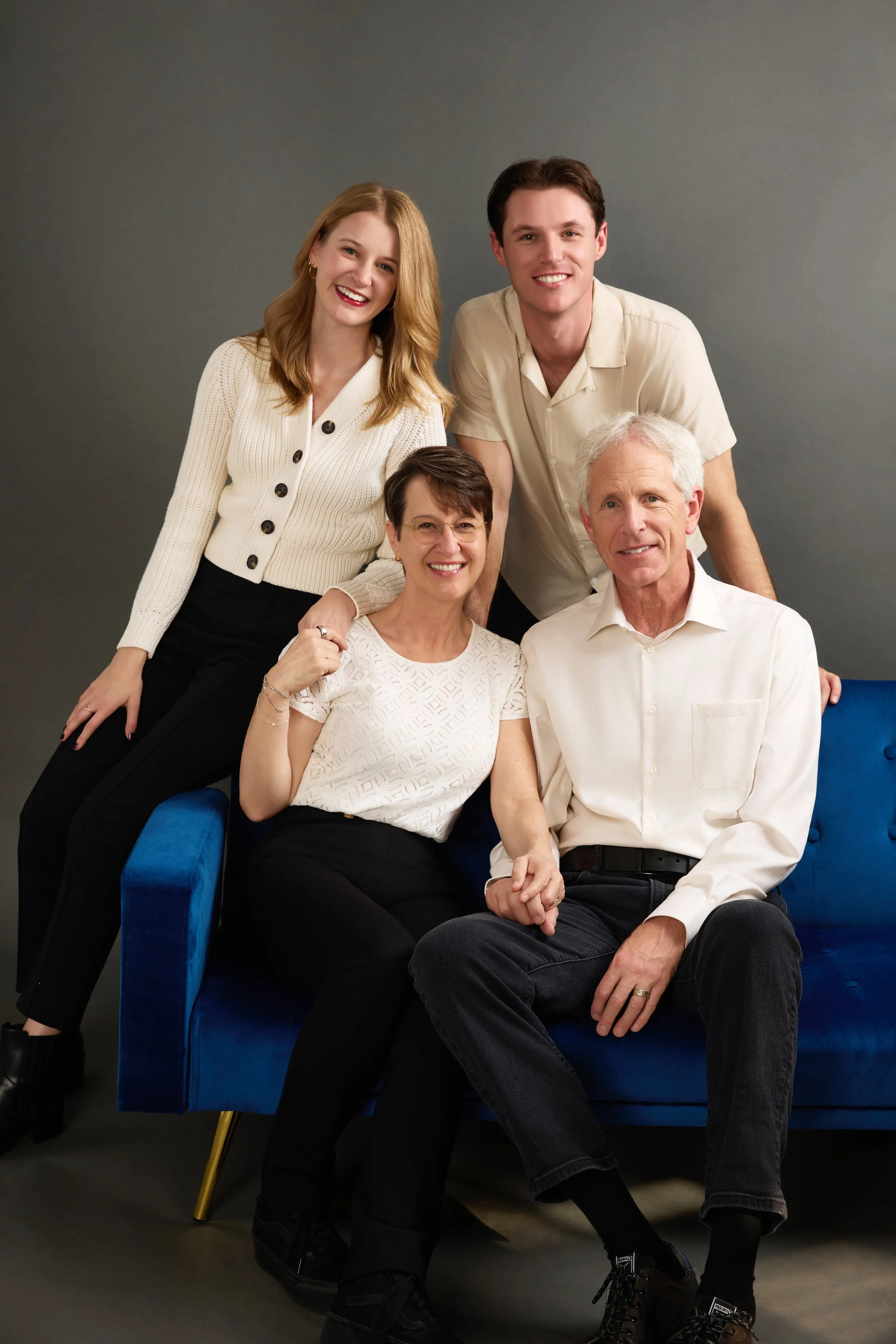
Neutrals + Earth Tones (works year-round): Cream, tan, beige, camel, olive, rust, chocolate. This palette photographs beautifully in every setting — studio, park, beach, urban. It feels warm and timeless, and the photos age well because nothing looks trendy or dated.
Soft Blues + Creams (spring/summer): Dusty blue, light chambray, ivory, white, sand. Clean and airy. Works especially well near water or in open fields with soft light. Keep the blues muted — a washed denim shirt is perfect, a bright royal blue is not.
Jewel Tones (fall/winter): Deep burgundy, forest green, navy, mustard, plum. Rich and warm against autumn leaves or darker studio backdrops. These tones add depth to the image without competing with faces.
Muted Pastels (spring): Blush, sage, lavender, soft peach, light gray. Gentle and feminine. Works well for maternity sessions, newborn family sessions, or families with young children where you want the overall feeling to be soft.
What to Avoid
Some things consistently cause problems in photos, regardless of the setting or the photographer:
Bright neon or fluorescent colors reflect onto skin and create color casts that are difficult to correct in post-production. A neon pink shirt will bounce pink light onto the face of whoever stands next to that person.
Large logos and graphic text pull the viewer's eye away from faces. Your family photos should be about your family, not the Nike swoosh on your son's chest.
Very busy patterns — small florals, thin stripes, complex plaids — can create a visual effect called moiré when photographed, which looks like a shimmering or buzzing pattern in the image. Larger, simpler patterns are fine. A wide stripe or a large check can work if it's in the right color family.
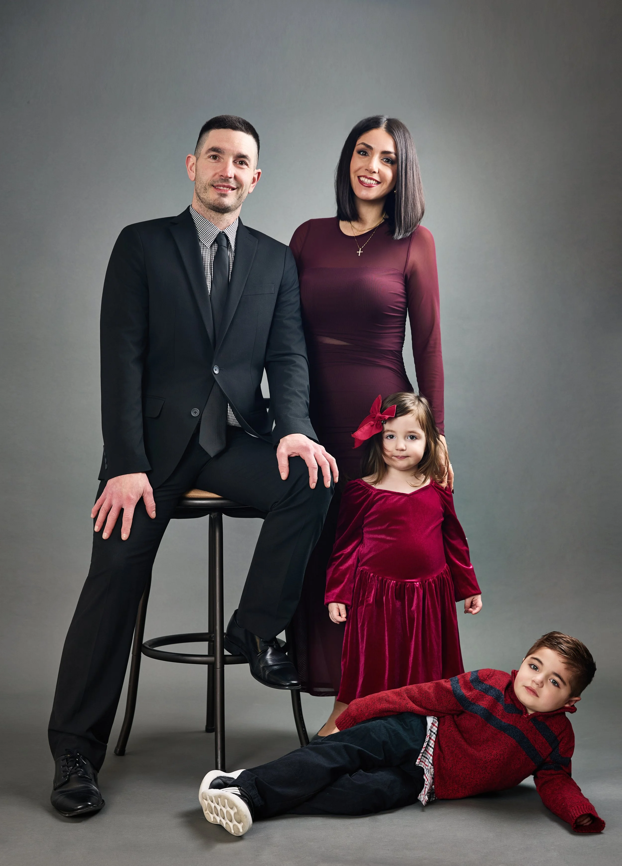
All black everything absorbs light and loses detail, making it harder to see body shape and arm placement. A little black is fine — a black blazer over a cream shirt, for example — but a family of four in all black reads as somber rather than warm.
All white everything can blow out in bright sunlight and make skin look flat. Like black, it works as an accent but not as the whole palette.
Dressing for Different Locations
Where you're shooting affects what you should wear:
Studio sessions: You have full control over lighting, so almost any palette works. This is where jewel tones and deeper colors really shine, because the controlled light brings out richness without harsh shadows. Avoid overly casual — athletic wear and flip flops feel out of place in a studio setting.
Parks and outdoor green spaces: Earth tones and muted colors complement the natural backdrop. Avoid green — you'll blend into the trees. Rust, cream, navy, and camel are safe bets.
Beach or waterfront: Light and airy palettes work best. Whites, soft blues, khaki, sand. Skip dark heavy fabrics — they look out of place against open sky and water. Bare feet are perfectly fine.
Urban/downtown: More flexibility here. Darker palettes, layers, textures, and even a slightly edgier look can work. Think of the backdrop as part of the outfit — concrete and brick pair well with warmer earth tones and deeper blues.
Coordinating Without Matching: A Practical Example
Let's say your family of four is shooting in a park in the fall. Here's a palette that works:
Dad: Navy henley or button-down, khaki chinos, brown leather shoes. Mom: Rust or burnt orange dress (midi length), ankle boots. Daughter (age 6): Cream or ivory dress with a small floral detail, brown sandals. Son (age 4): Light blue chambray shirt, khaki shorts or pants, brown shoes.
Nobody is wearing the same color. But when they stand together, the navy, rust, cream, and blue all feel like they belong in the same photograph. The browns in the shoes and boots tie everything together subtly.
That's the goal. Not matching. Belonging.
Tips for Different Family Members
For men and dads: A well-fitted button-down shirt is the safest choice for photos. Roll the sleeves for a more relaxed look. Avoid shirts that are too baggy — they create visual bulk that doesn't look great in frame. Jeans are fine if they're clean and well-fitted. Khakis and chinos photograph slightly better because the texture is smoother.
For women and moms: Dresses and skirts tend to photograph better than pants because they create movement and shape. A midi-length dress in a solid color or very subtle pattern is one of the most reliably photogenic choices. If you prefer pants, a well-tailored pair with a tucked-in blouse works beautifully. Avoid anything too tight or too loose — both are distracting on camera.
For toddlers and babies: Comfort is king. An uncomfortable child in a stiff outfit will cry for the entire session. Pick something soft, easy to move in, and in a color that works with the palette. One-piece rompers photograph cleanly on babies. If your toddler insists on wearing the dinosaur shirt, consider it as an option for a few fun candid shots after the coordinated ones.
For teens: Give them some say. If they feel forced into something they hate, it shows on their face. Agree on a color family and let them pick the specific pieces. A teen who chose their own outfit will give you more natural expressions than one who was dressed against their will.
Layers and Textures Add Visual Interest
A family standing in five solid-colored shirts looks fine. But a family with layers — a cardigan here, a vest there, rolled sleeves, a scarf, a hat — looks styled. Not overdone. Just intentional.
Texture does the same thing. Mix a knit sweater with a cotton dress. Put a denim jacket over a soft blouse. Pair suede boots with a linen skirt. These subtle differences give the photographer more to work with and make the images feel richer.
When in Doubt: The Capsule Approach
If you're overwhelmed, use this formula:
Pick one anchor color (navy, olive, rust, cream). Pick one complementary color (something that pairs well). Make sure every person is wearing at least one of those colors. Add one neutral (white, gray, tan) to balance.
That's it. Four people, two intentional colors, one neutral. It works every time.
A Note About Seasons and Timing
The time of year doesn't just affect the backdrop — it affects the light, which affects how colors render in your photos.
Golden hour (the hour before sunset) warms everything up. Cool tones like blue and green get softened. Warm tones like rust and gold glow. If your session is at golden hour, lean into that warmth.
Overcast days produce even, diffused light that makes colors appear exactly as they look in person. This is a great time to wear bolder or cooler colors because the light won't shift them.
Midday sun in summer is harsh and creates strong shadows. If you're shooting in direct sun (which most photographers avoid), lighter clothing prevents the contrast from becoming too extreme.
Quick Checklist Before Your Session
Here's what to run through the night before:
Lay all the outfits together on the bed. Step back and look. Do they feel like a cohesive group? If one piece jumps out as "off," swap it.
Iron or steam everything. Wrinkles are very visible in photos and difficult to remove in post-processing.
Try everything on. Make sure it fits the way you want. Session day is not the time to discover that the zipper doesn't close.
Pack a backup outfit for kids. Spills happen.
Skip brand-new shoes for toddlers. They'll trip, they'll cry, and the session will stall.
Bring a lint roller. Pet hair on a dark blazer shows up in every single photo.
Your Photos Should Look Like Your Family
The best family photos don't look like a catalog shoot. They look like a real family — your family — on a really good day, in clothes that feel like them, captured in a way that you'll actually want to hang on your wall ten years from now.
Outfit coordination matters because it removes visual distractions and lets the connection between the people in the photo become the focus. That's all it's doing. It's not about fashion. It's about making sure nothing in the image is louder than the way your daughter looks at her dad, or the way your son clings to your leg, or the way you and your partner lean into each other without even thinking about it.
That's what we photograph. The outfits just help us get there
Luminous Space is a family portrait photography studio in San Mateo, California, serving families throughout the San Francisco Bay Area. We offer studio and on-location family sessions with posing direction, wardrobe guidance, and same-day photo selection. Book your family session →