
Best Colors to Wear for Headshots: A Color-by-Color Breakdown
Color is the single fastest way to change how a headshot feels. The same person, in the same lighting, with the same expression, looks completely different in navy versus bright red versus white. One reads as trustworthy. One reads as aggressive. One washes out under studio light.
Most headshot guides give you a generic list — "wear dark colors, avoid neon" — and call it a day. That's fine as far as it goes, but it doesn't help you decide between the charcoal blazer and the navy one hanging in your closet right now.
Here's every color that matters, what it does on camera, and when to wear it.
Navy Blue
This is the default recommendation for a reason. Navy is universally flattering across skin tones, it reads as professional and trustworthy on camera, and it works against every standard headshot background — white, gray, dark, or textured.
Navy absorbs light evenly, which means it doesn't create hot spots or reflections. It's dark enough to look serious without being as heavy as black. It's blue enough to feel approachable without being as casual as a light blue.
If you own one well-fitted navy blazer or button-down, you already have the safest headshot outfit in your closet.
Best for: Literally everyone. Corporate, creative, medical, legal, tech. Navy is the Switzerland of headshot colors — it offends no one and flatters almost everyone.
Charcoal Gray
Charcoal is the second-safest choice. It's slightly softer than black but still carries authority. On camera, charcoal retains more detail than black — you can see the texture of the fabric, the shape of lapels, the way the sleeve falls. Black tends to flatten into a dark mass under studio lighting. Charcoal keeps its dimension.
The tone of charcoal also complements gray backgrounds without blending into them, which is useful since gray is the most common headshot backdrop.
Best for: Finance, consulting, legal, corporate — any context where authority matters. Charcoal reads as "I'm serious about what I do" without the heaviness of black.
Black
Black is powerful but tricky. It absorbs light more than any other color, which means detail disappears. In a tightly cropped headshot, a black shirt or jacket can turn into a featureless dark shape below your face. That's fine for a dramatic, editorial look — but it can feel too heavy for an everyday professional headshot.
The fix is texture and layering. A black blazer over a lighter shirt (white, cream, light blue) gives you the authority of black with enough contrast to keep the image interesting. All-black from collar to crop line is harder to pull off unless the lighting is specifically set up for it.
Black also creates strong contrast against light backgrounds, which can look striking or stark depending on the context. Against dark backgrounds, you risk disappearing.
Best for: Editorial and creative headshots where drama is intentional. As a layering piece (blazer, jacket) rather than the only visible color. Executive portraits where the lighting is designed to handle it.
Avoid for: Standard corporate headshots against gray backgrounds. The combination of black clothing and gray background can feel flat and lifeless.
White
White reflects light. A lot of it. Under studio strobes, a bright white shirt bounces light up into the underside of your chin and jaw, which can flatten facial definition and create an unflattering upward cast.
Off-white, ivory, and cream are significantly better. They're close enough to white to feel clean and fresh, but they absorb just enough light to avoid the bounce problem. If you're set on wearing white, a matte fabric works better than a shiny one.
White also competes with skin for the brightest part of the image. In a headshot, your face should be the brightest element — that's where the viewer's eye goes first. A stark white shirt or blouse can pull attention downward.
Best for: Layering under a blazer or jacket (where only the collar is visible). Summer or outdoor sessions where natural light is softer. Headshots against dark backgrounds where the contrast works in your favor.
Avoid for: Solo white tops against white or light gray backgrounds. The low contrast makes the image feel washed out.
Deep Burgundy / Wine
Burgundy is one of the strongest "non-neutral" colors for headshots. It's rich and warm without being loud. On camera, it adds a depth and sophistication that neutral colors can't quite match. It complements warm skin tones beautifully and adds warmth to cooler skin tones.
This color works particularly well in fall and winter contexts, or against darker backgrounds. Against a white background, it creates a clean, modern contrast that feels polished.
Best for: Women especially — burgundy is one of the most universally flattering colors for female headshots. Also works well for men in a sweater or open-collar shirt. Creative professionals, authors, speakers, coaches.
Forest Green / Hunter Green
Deep green is underrated in headshots. It flatters an exceptionally wide range of skin tones — from very fair to very deep — and it reads as grounded, calm, and approachable. Forest green has a natural warmth to it that feels organic rather than corporate.
On camera, it holds detail well (similar to navy) and doesn't compete with facial features. It's an unusual enough choice that it stands out slightly from the navy-and-gray majority without being distracting.
Best for: Therapists, coaches, educators, wellness professionals, anyone in a field where warmth and groundedness matter. Also a strong choice for personal branding sessions where you want something distinctive but not flashy.
Deep Teal / Petrol Blue
Teal sits between blue and green, and it has a richness on camera that's hard to beat. It's more interesting than navy, warmer than a pure blue, and distinctive enough to be memorable. Under studio lighting, deep teal picks up a subtle luminosity that photographs beautifully.
This is a color that looks good on almost everyone but that very few people actually wear to their headshot session. If you have a well-fitted teal top or blazer, consider bringing it.
Best for: Women in professional services, creative professionals, tech, anyone who wants to stand out slightly from the navy-charcoal-black crowd without going bold. Works across all standard backgrounds.
Bright Red
Red is the most attention-grabbing color in the spectrum, and that's exactly the problem in a headshot. A bright red top or dress pulls the viewer's eye to the clothing before the face. In a headshot — where the entire purpose is your expression and your eyes — that's counterproductive.
Red also bounces color onto skin, creating a warm reddish cast on the neck and jawline that's noticeable and difficult to correct in post-production without affecting the overall color of the image.
Deep red and burgundy work because they're muted enough to not overpower. Bright, saturated red is almost always too much.
Best for: Very specific creative or editorial contexts where the red is intentional and the composition is designed around it. Not for standard professional headshots.
Avoid for: LinkedIn, corporate websites, medical directories, legal directories — anywhere the headshot needs to feel neutral and professional.
Pastels (Blush, Lavender, Soft Blue, Sage)
Pastels read as soft, approachable, and feminine. They work well for wellness professionals, therapists, coaches, and anyone in a field where gentleness is part of the brand. Under studio lighting, pastels can sometimes wash out lighter skin tones, so the specific shade matters — a slightly deeper blush works better than baby pink.
Pastels against white backgrounds can feel too light — there's not enough contrast. Against gray or dark backgrounds, they create a pleasant, modern contrast.
Best for: Therapists, wellness professionals, coaches, maternity and family-focused professionals. Spring and summer personal branding sessions.
Avoid for: Corporate, legal, finance — pastels can read as too casual in conservative industries.
Mustard / Ochre
Mustard is a bold choice that works surprisingly well in headshots when it suits the person wearing it. It's warm, distinctive, and photographs with a richness that's hard to replicate with other colors. However, it doesn't flatter all skin tones — it can wash out very warm or olive-toned skin.
Test it in a mirror under bright light. If your face looks healthy and your skin tone holds up, it'll work on camera. If your face looks sallow or yellowish, skip it.
Best for: Fall sessions, personal branding, creative professionals, authors. Works especially well on darker skin tones.
Patterns: When They Work and When They Don't
Solid colors are always safer than patterns, but patterns aren't automatically disqualifying. Here's the rule:
Large, simple patterns (a wide stripe, a big plaid) can work if the colors are in the right family. The pattern adds visual interest without creating distraction.
Small, tight patterns (thin stripes, small florals, houndstooth, gingham) can create moiré — an optical interference pattern that looks like shimmering or buzzing in the photo. This is a real technical issue, not just an aesthetic preference. Small patterns and digital camera sensors don't get along.
If you're unsure about a pattern, bring it as a backup option and also bring a solid. Your photographer can test both and tell you which one the camera prefers.
The Decision Framework
If you're standing in your closet right now trying to decide:
Safest choice: Navy. It works for everyone in every context.
Second safest: Charcoal gray. Authority without heaviness.
Want to stand out slightly: Deep teal, burgundy, or forest green. Distinctive but not distracting.
Want drama: Black, but layer it. Black blazer over a lighter top.
Want warmth: Earth tones — rust, camel, olive. Especially for outdoor or branding sessions.
Want softness: Pastels in a slightly deeper shade. Avoid anything too pale.
Always avoid: Neon anything. Bright red. Bright orange. Electric blue. These are for music videos, not headshots.
And bring a second option. Always bring a second option.
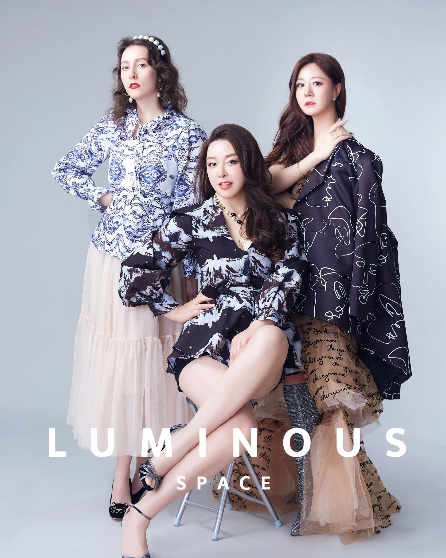
Luminous Space is a professional headshot photography studio in San Mateo, California. We include wardrobe guidance with every booking. Book your headshot session →
Related: What to Wear for Professional Headshots → · How to Pose for Headshots →